
A well-placed statistic can be very helpful in convincing an audience of the validity of your argument. Knowing how people are often cowed by a writer with math at her command, it is, in fact, tempting to overwork the power of statistics. A little arithmetic can go a long way. In our essay on the dearth of news in today's news programs (click HERE), we could have used some statistics to back up our point — using a stopwatch to record the actual minutes spent on advertising instead of the news, spreading this statistical study over several evenings and weeks, seeking some statistics on industry standards on advertising time, etc.
As everyone knows, the trouble with statistics is that it's so easy to lie with them. Citing the average annual household salary in the state of Connecticut — approaching $100,000 — makes it sound like everyone in the state is rich. The real truth behind that statistic, however, is that there is an alarming disparity between those who "have" in Connecticut and live in some of the nation's richest communities and those who "have not" and live in some of the nation's poorest neighborhoods. Averages sometimes don't mean very much. A graphically represented statistic can also be made to lie. If one country has three times as many soldiers as another and we represent the difference this way —
Their Guy |
![[Our Guy]](../images/soldier.gif) Our Guy |
we've told a lie. The soldier on the right isn't just three times as tall as the soldier on the left; we stretched Our Guy out proportionally (width as well as height). We didn't multiply one times three to get three; we squared three and got nine, so Our Guy ended up being nine times as big as Their Guy.
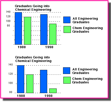
A similar lie can be told with a bar graph in which we chop the bottom off the graph (not starting at zero) so that disparities will seem much greater than they really are. (Pie charts are usually harder to cheat with.) In the top version of the chart below, the difference between the total number of graduates and the graduates entering chemical engineering doesn't seem nearly as dramatic as the difference in the bottom version of the same chart. We have truncated the bottom half of the chart in the bottom version and we've doubled the space between the numbered lines. The numbers say the same thing, so the bottom chart doesn't lie, exactly, but it does graphically distort the facts.
Statistics need to be fresh — the number of high-schoolers who smoked cigarettes in 1977 doesn't mean much unless we have more recent statistics to show how things have changed — and the statistics need to be taken from a respected resource. Generally, government and academic resources are reliable, relatively unbiased providers of statistical information.
There's a wonderful online resource on using statistics in writing — eminently readable, even by people who fear statistics — that everyone should read: Robert Niles's "Statistics Every Writer Should Know." It covers the basics like average versus median and explores topics such as sample sizes and margin of error. This document will make you a more intelligent reader as well as a more intelligent user of statistics in your writing.
The other sub-sections of this part of Principles of Composition are as follows: